Chicken of the Sea
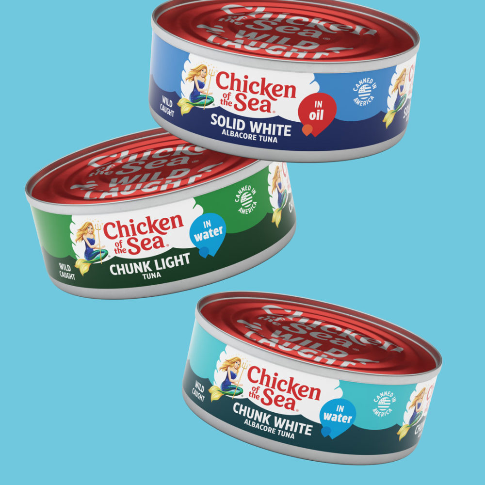
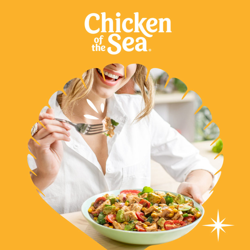
This is the first complete rebrand for Chicken of the Sea in more than 20 years. It began with articulating the brand’s promise to consumers that they can eat healthy and live happy and infusing that ethos throughout every facet of the brand experience — from the new packaging design at shelf, to the new website, to the launch campaign’s “Wild-Caught Happiness” tagline.
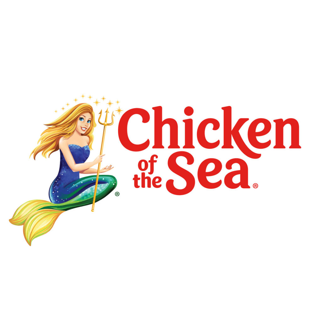
Today’s Catalina, like the brand, is a leader and a change agent for good which prompted the more modern illustration style. To help with brand visibility, Catalina was removed from the center of the logo, which serves multiple purposes. She can evolve as a standalone character, while allowing for a clean wordmark that can be stacked and scale in size.
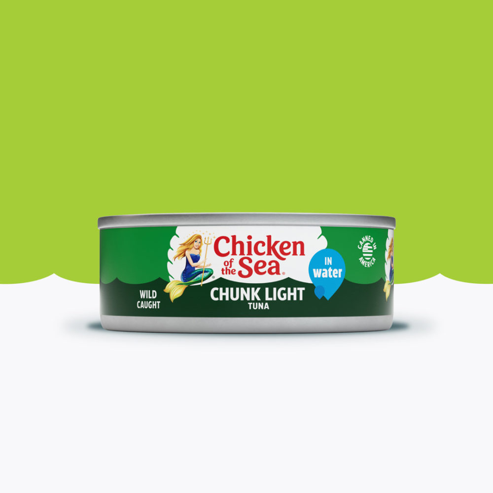
The brand is now anchored in a white clamshell that creates a bullseye at shelf and is uniquely relevant to the sea. Communication was pared down to include brand, variant and key claims like ‘wild-caught’ to help consumers shop the shelf. Every aspect of the brand’s visual and verbal language was considered and updated across the portfolio in a thoughtful way to make the iconic brand fresh and vibrant.
Brand Strategy / Identity / Tone of Voice & Messaging / Packaging Design / Ad Campaigns / Website Design / Brand Mascot Design / Animation / Digital Assets / Brand Book
