
Oct 3, 2021
When Little Big Brands looked closely at how healthy snack branding and packaging trends had changed since the launch of the Simply7 brand in 2011, they quickly realized the category had exploded with competitors and that to remain relevant Simply7’s look needed greater shelf-impact.
“With the brand purpose no longer being unique and the graphics looking dated, we wanted to give the brand a new and meaningful visual identity,” Pamela Long, Little Big Brands Director of Client Services says. “Our process was as simple as the snacks in the bag: Conduct a category visual audit to understand where white space and messaging opportunities existed, develop a broad range of concepts test, revise, test again and then bring to life.”
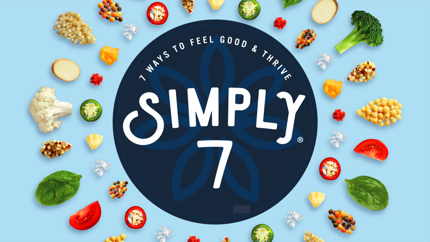
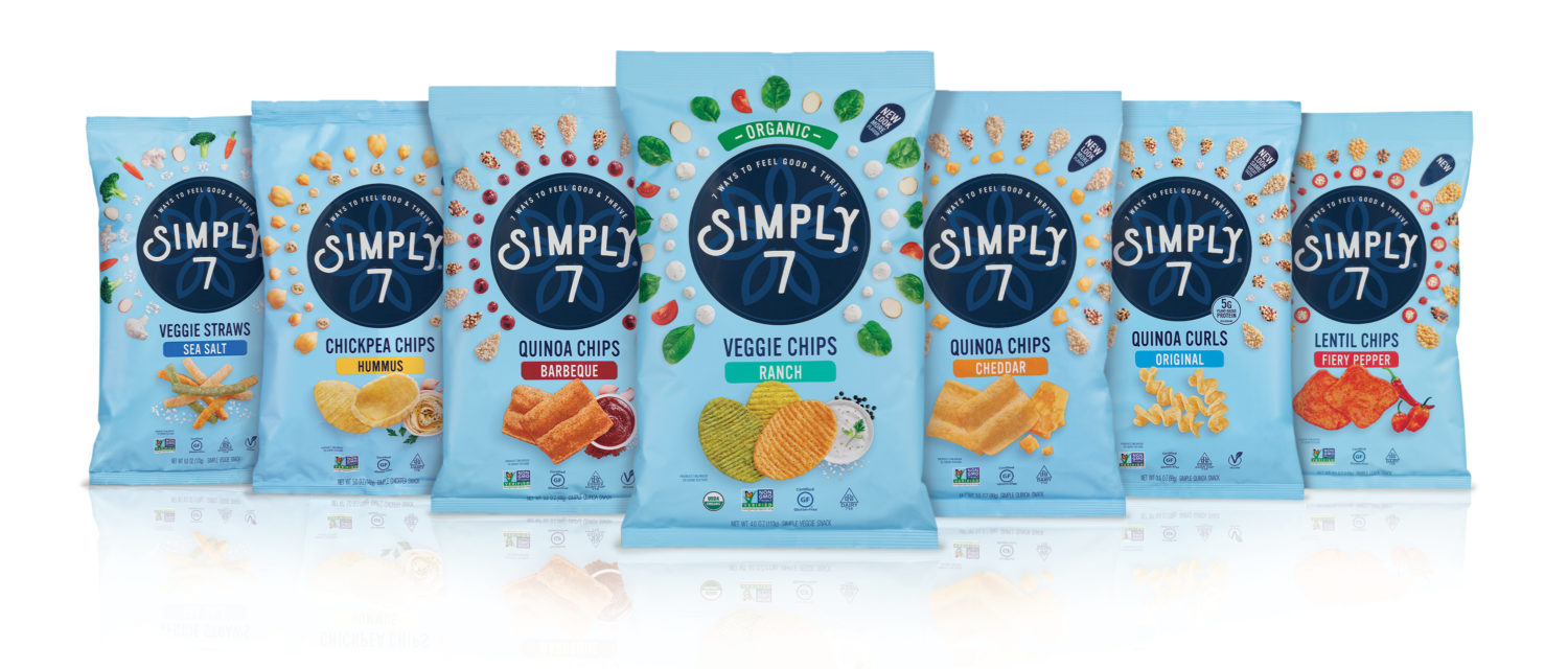
The redesigned Simply7 packaging features a powerful brandmark, with a unique-to-category optimistic blue sky and a navy bullseye. The new visual identity features a burst of wholesome ingredients and an elevated product promise, ‘Goodness Made Simply.’™
Also, the number 7 in the brand’s name has evolved as well from the number of ingredients in each snack, to more lifestyle based with 7 lifestyle tips such as “Eat Mindfully,” “Give Gratitude,” and “Be Present,” all supporting the new tagline “Feel Good & Thrive.”
Republished from AdForum, July 28, 2021.


