
Mar 16, 2021
Hyland’s has been the trusted source of natural, effective health solutions for over 115 years, but their Baby and Kids lines needed to find a better way to connect with first-time Gen Z moms.
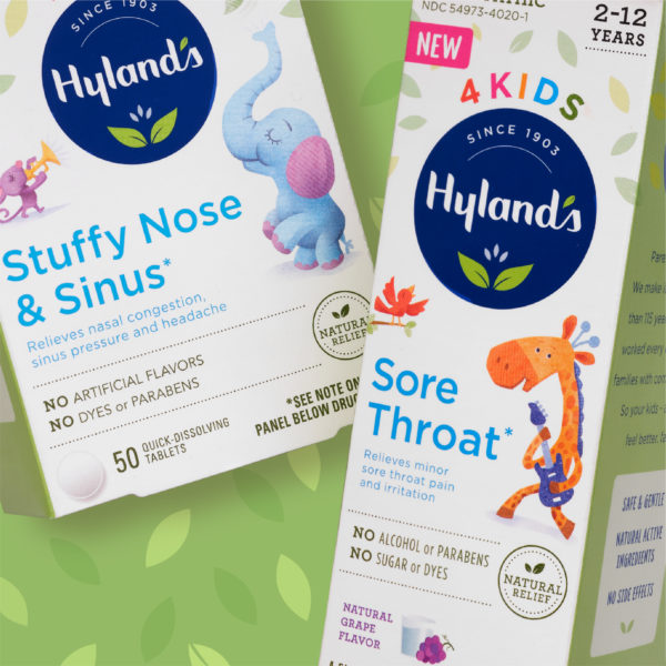
We worked with Hyland’s to help them compete in the space owned by legacy OTC drug brands and contemporary natural brands. By leveraging the key brand message, “A Heritage of Healing,” we re-strategized how the brand lives in retail and online. We looked at the semiotics of the brand and identified an opportunity to tap into a cherished bonding experience – storytime. We then created a modern and consistent white canvas, so we could clearly communicate the claims and benefits while bringing the portfolio together so it was recognizable on shelf.
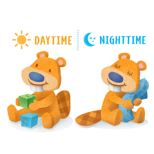
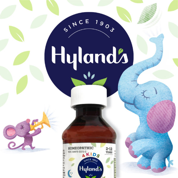
The baby photography and kid illustrations were replaced by a storybook style of custom animal illustrations whose attributes matched the product. A lion (who roars) for cold & cough, an elephant (with his large trunk) for stuffy nose, a (toothy) beaver for oral pain. These new characters help tell the story of a brand that fits the different stages of childhood. The Baby and 4Kids packaging could now capture the value of Hyland’s rich heritage and legacy as the experts in homeopathy trusted by generations of moms.
We are proud to announce that Hyland’s has won a Health+Wellness Graphic Design Award for GDUSA.
Designed by LBB


