Aug 2, 2023
Originally designed by brother Mark and Jon Sider as a healthy alternative for athletes, Greater Than picked up a large following of breastfeeding mothers who believe its products increase milk supply. The company chose New York-based design firm Little Big Brands to reimagine its identity to match with its new target audience.
With Greater Than becoming the most popular lactation support beverage on Amazon, Little Big Brands needed to revise its brand communication and packaging. This was achieved by targeting the overall brand strategy and undertaking a category and competitor analysis which taught the design agency that it was not just mothers drinking Greater Than products, but their families, too.
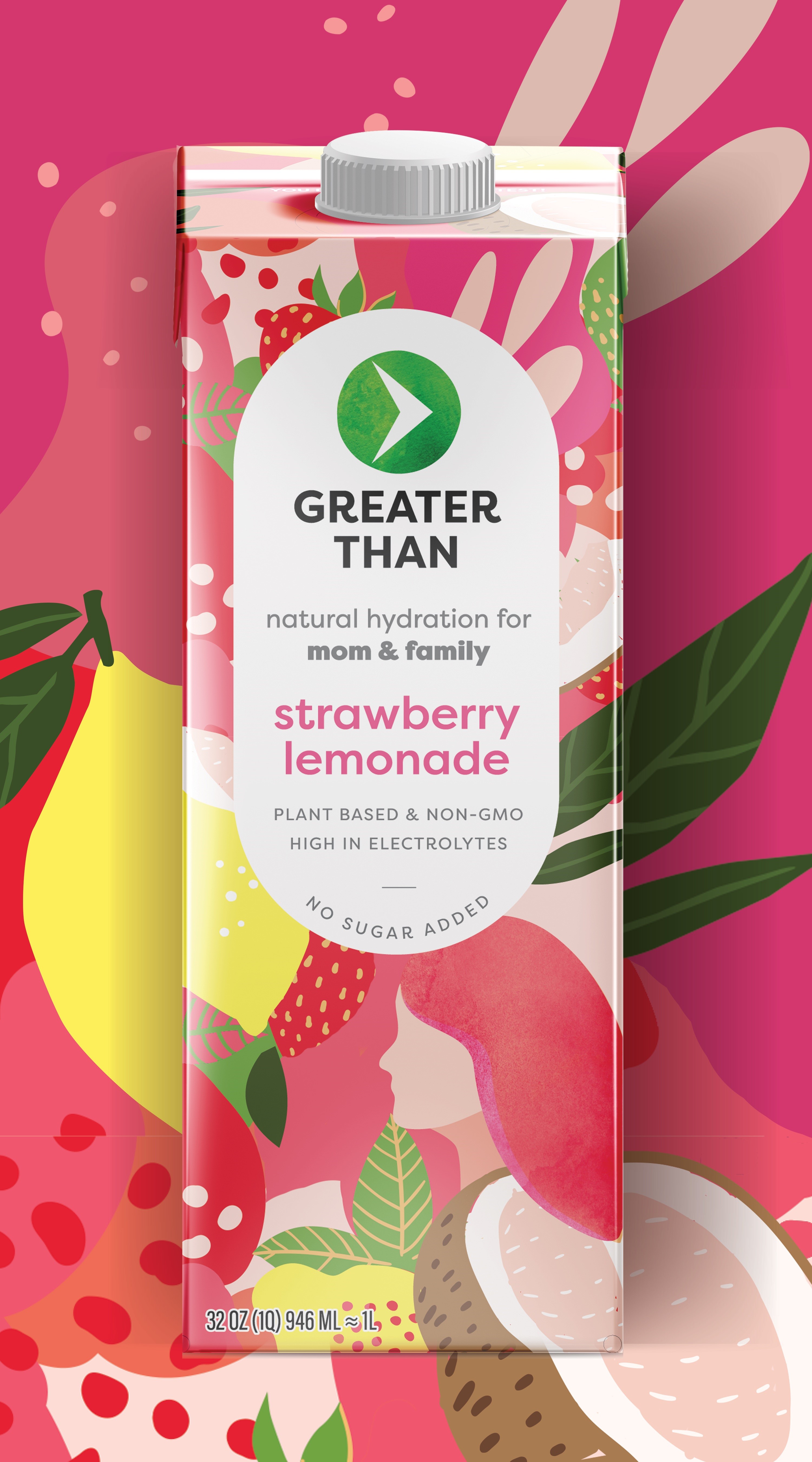
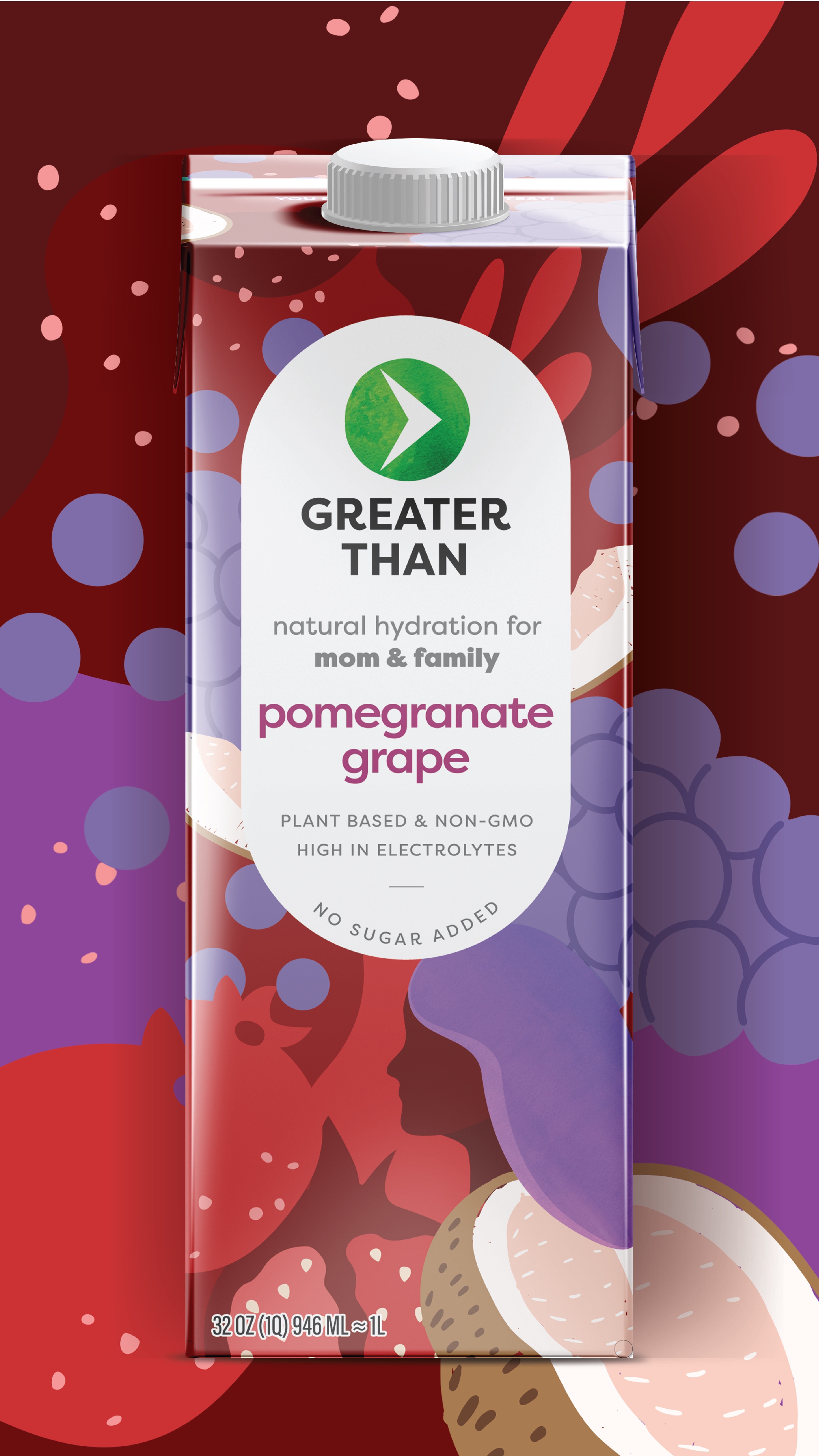
On learning this, the final design by Little Big Brands aims to celebrate the vibrant and natural ingredients used to flavour each product. A female silhouette is also used to celebrate women and represent the Greater Than gatekeeper. Additionally, all branding and front panel information has been intentionally displayed in a clear and organised manner.
from Transform Magazine


