
Mar 7, 2023
Red is relevant—and mermaids are now empowered
By Robert Klara
Word to the wise: If you happen to spot a mermaid, it’s best to get away from her. Fast.
Depending on what folklore you believe, mermaids possess the power to conjure storms, cause floods, lure men into the water to drown, induce ships to wreck on rocky coastlines and abscond with children.
But when it comes to American corporations, mermaids have a decidedly kinder reputation.
Starbucks’ mermaid logo has made it among the most recognizable brands on earth (even though she is, technically, a two-tailed siren called a Gorgona.) Craft beer pioneer Coronado Brewing puts a mermaid on all of its bottles, which have (incidentally or not) won awards the world over. And the 1989 movie The Little Mermaid not only generated a lifetime gross of some $235 million, it saved Disney Animation Studios.
The mermaid has also been kind to Chicken of the Sea—the household name brand of canned tuna that first put a mermaid on its label in 1952. Chicken of the Sea is among three market leaders (StarKist and Bumble Bee are the others) in a segment worth an estimated $8.44 billion, according to data from Expert Market Research.
As recent history has shown, brand mascots of yore haven’t aged so well into the era of more enlightened social thinking. But it wasn’t a social faux pas that prompted the brand to bring its mermaid in for a facelift. It was simply… time. Chicken of the Sea needs to hook a younger generation of consumers, and the recent mascot makeover (part of a larger rebranding that includes the can itself) is central to that effort.
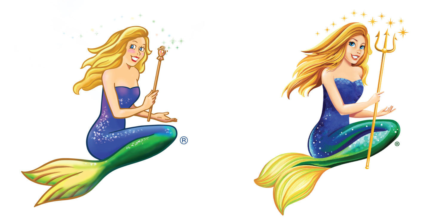
“We were looking for a brand icon that’s ready for the digital age—we needed to modernize Catalina,” said Chicken of the Sea commercial evp Andy Mecs, referring to the name customers gave the mermaid in 2014 following a contest that drew 49,000 entries. “If you look at the previous iteration, the graphics were really cartoonish and didn’t play so well.”
“With any good brand mascot, they need to evolve with the times,” added John Nunziato, founder of branding and package design firm Little Big Brands, which handled the creative lift. “It was time for Catalina to evolve.”
Easier said than done, of course. Unlike human mascots (Mr. Clean, Captain Morgan) or animals (Tony the Tiger, Chester Cheeto), a mermaid is the most phantasmagorical of figures. What’s a contemporary mermaid supposed to look like? Here’s a walkthrough of how the brand and its agency modernized Catalina, while also making some strategic tweaks to the tuna can she calls home.
The mermaid gets a promotion
Thanks to movies including 1984’s Splash and 2011’s Pirates of the Caribbean: On Stranger Tides, mermaids are often regarded as voluptuous creatures. Fortunately for Chicken of the Sea, Catalina has never swum beyond a G rating. (As Mecs put it, “The mermaid can be a family icon, so we’re going to run with that.”)
The problem was, even for a cartoon, Catalina looked too much like a comic book character.
Fortunately, advances in digital 2D illustration allowed Nunziato’s team to add detail and depth to the mascot’s face and hair, plus some iridescence to her tail—modifications that make her “more relevant, fresh and modern,” in his view.
But the most important change is one that’ll probably register with consumers only subconsciously. The brand wanted Catalina to come across as more confident and assertive—more like a leader—which is why her expression gained definition and the graphic artists straightened her bearing ever so slightly.
“In just a little bit of body form and posture,” Nunziato said, “we were able to communicate more empowerment, a bit more strength.”
Oh, and she’s now wielding the sea god Poseidon’s trident in her hand. If that’s not empowerment, what would be?
A cleaner look for the type
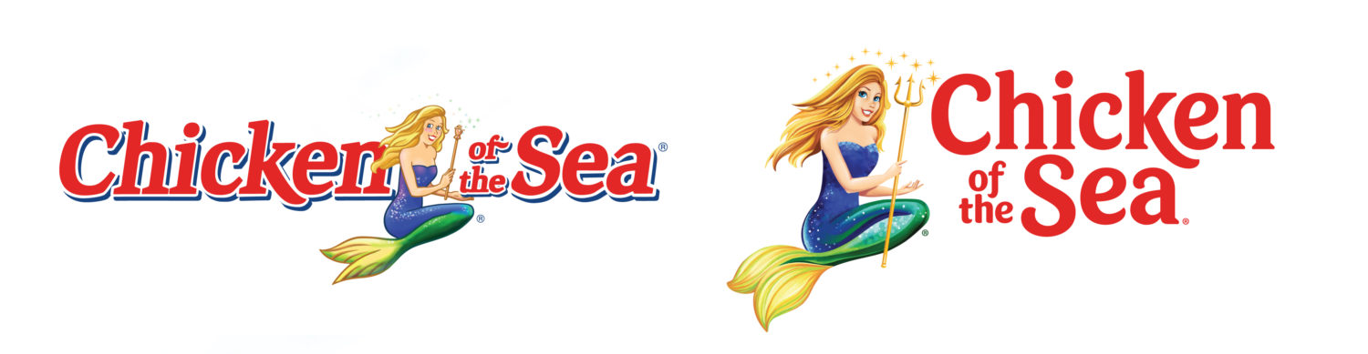
While it was having Catalina spruced up, Chicken of the Sea sought to address its logotype, too. First off, management decided that the mermaid’s former place in the middle of the brand’s name was problematic.
“Having Catalina in the center made it difficult to read or see anything,” Mecs said. “Moving her off to the side made it a lot more legible, a lot more visible.”
Detached from the logotype, Catalina can now easily be used on her own: She is more “postable” online, for example. Her departure also enabled a double-decker treatment for the brand’s name, creating a vertical complement to what’s otherwise an entirely horizontal canvas.
“By shifting Catalina left and stacking our logo, we were able to use that real estate more effectively and center that logo within that clamshell shape, which is relevant to the sea and a beautiful holding device,” Nunziato said.
Nunziato’s team did retain Chicken of the Sea’s familiar typeface—recognition matters, after all—but it shook off the blue shadowing in favor of a cleaner look. The prominence of red was no accident, either.
“Over the years,” said Mecs, “I’ve done some different eye-tracking studies and seen some studies where we noticed that the first color the consumer noticed in the store was red.”
Opening up the can
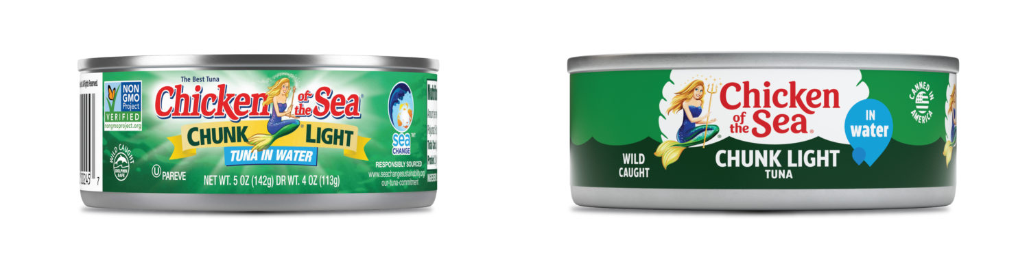
A quick glance at the tuna can itself reveals the most obvious design update: There’s simply a lot less going on.
While the old label had some aesthetically pleasing features, including the ripple effect of the green ocean behind all of the type, “we needed a much cleaner label,” Mecs said, “where consumers can better identify our brand.”
Because the green background made the can easy to identify, Little Big Brands retained that color palette but also simplified it. “We moved away from printing heavy-burst vignette in the background,” Nunziato said. “That vignette was conflicting with the background colors.”
The profusion of wording on the old label forced all the type to be smaller and, hence, less readable. Now, only the essential verbiage appears—this is chunk light tuna in water, end of story.
Meanwhile, the dark green ocean background allowed for the descriptor “Wild Caught” to pop. “Wild caught is very high on the list of what is relevant to consumers today,” Mecs said. “Tuna is almost 100% wild caught [anyway], but a lot of consumers don’t know that.”
Perhaps the savviest adjustment—impossible to see in these photos—is simple replication. Because tuna cans are both round and stacked on supermarket shelves, shoppers who pick them up tend to put them down with the brand name facing the wrong way—a lost opportunity for the brand. Nunziato’s solution was a double-facing treatment for the label.
“Now, we have two front panels,” he said. “So if the consumer puts the can back cockeyed, we have a better chance of having a front panel show.”
Overall, every change made “has everything to do with shopability,” Mecs said. Unlike a frozen pizza or a bag of chips, whose size alone can draw a customer’s eye, “a tuna can is pretty small to begin with.”


